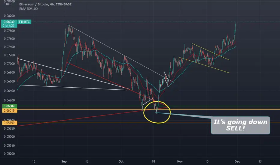
IF THERE IS JUST ONE SINGULAR CHART TO FOLLOW THIS IS ITETH/BTC RATIO Chart looking like its about to take off!!
Search in ideas for "RATIO CHART"
Golden Ratio Natural BitcoinNot gonna lie - the fact that Bitcoin is teaching us that God is really just a fractal - as well as everything else in existence - and our actions and psychological behaviors are somehow pre-programmed and made manifest in golden ratio chart trading patterns is well...is something.
Chaos in order... How we will behave in the future is dependent on our free-will. Err I mean dependent on the fibonacci sequences.

Gold vs Silver Daily Ratio ChartGold vs Silver Ratio's daily chart trying to stay up...
Will it lose it's grip?

The Dollar's last hoorahThis chart shows DXY over an equal weighting of gold + silver + crypto. The idea is that these asset classes could potentially replace the dollar in global reserves, thus weakening the dollar. During a downtrend in the dollar starting in March 2020, we see a channel up in the dollar while alternative assets even sell off during the same period. In this ratio chart, a rising wedge is near it's pinnacle, revealing a continuation in the downward trend for DXY and bullishness for metals and crypto. I expect this chart to fall to around 30 before end of 2022. That is, January levels on DXY around 90.
This chart also shows a bullish case for those alternative assets. Gold and silver just completed an inverted head and shoulders pattern and look ready to start a new bull run. Bitcoin just reached a new ATH.

BTC - Long Con Double off the WallBitcoin has doubled in short order.
There is an interesting correlation to Energy within the Price Structures.
I've been running some Ratio charts I post later that provide some
fascinating support of the "Stored Energy" Thesis.
BTC:$WTIC
and
BTC:$NATGAS
These two Ratios both provide insight.

Approaching final leg in Bullish Gartley HarmonicDow vs Gold's Quarterly Ratio Chart, 16 year cycles, important bottom rail, and of course a Gartley harmonic.
Tough to get a perfect one... still hunting.

Rotation Back into Junk Bonds & Large Caps Q4The JNK/TLT ratio chart visualizes investors' position in greed and safe bonds. An increase means more greed in the market, corresponding with an increase in equities. Based on where we are, I am expecting one last run in the stock market, reaching the top of our resistance trend-line. I have added a fractal to support this thesis.

Bitcoin: Think 2021 is like 2014 & 2018? Think Again.Many bears are comparing the 2021 Bitcoin price action to that of 2014 and 2018. The BTC/SPY ratio chart suggests this time is already different. I suspect many bears will be in for a rough period ahead, and many no-coiners will be left on the sidelines as Bitcoin enters the next bull run. Two essential items to note:
1: The 30-week SMA has failed to hold the ratio down. With this week’s (pending) close, the ratio will close above the critical moving average for the third time after the “top” was put in. This close above the 30-week SMA NEVER happened in 2014 or 2018.
2: The momentum (via PPO – bottom of the chart) has failed to put in a bearish crossover as the bulls send prices higher.

Dow Jones vs Silver's monthly ratio chartTarget is 2011 lows (and start of bearish expanding ascending wedge).

Dow Jones vs Gold's monthly ratio chartImportant resistance line doing it's thing.
Target is sub 10 (start of bearish ascending expanding wedge), with possible over shoot to 2011 lows.

Banknifty Ratio Chart (Nifty Base)Strong confluence region for support and resistance
Breaking of trend line is important

Glencore Plc vs Anglo American Plc (London)Late last week on the trading desk, I presented a technical chart highlighted my perspective of the monthly chart for Glencore relative to Anglo American Plc on the London Stock Exchange (LSE), with the comment as follows:
The relative monthly chart for GLEN vs AAL is suggesting the potential for a long-term shift, where GLEN could outperform AAL.
I've overlayed Albermarle (one of the world's biggest lithium producers) and Piedmont Lithium highlighting how the relative ratio chart could 'catch up'.
Glencore's portfolio is well-positioned to benefit from the EV revolution which is in its infancy.
Note the base having developed, with the price now having pushed up to a 17-month high.
In addition, the 14-month RSI is attempting a 6-year downward trend line breakout.
Note: For the sake of clarity, the chart presented here is without Albermarle and Pidemont.
So far we have seen the relative price rebound twice off the 200-day and has advanced by +4% so far this week. Can it continue?
For more insights, perspectives and real-time trade ideas, get in touch today.

Dow Jones vs Silver Monthly Ratio Chartuptrend dead, not able to stay above (now flat)
green Ichimoku cloud defined uptrend
1 year moving average dipping longer below 3 year moving average

Junior Silver miners vs Bitcoin daily log ratio chartDistance from 50 day moving average showing some momentum change in favor of junior silver miners vs bitcoin.

greatest gold to silver ratio chart of all time as said in the title, if you're short gold and silver, you better hold onto your hamburgers.

Silver Junior Miners vs Silver Monthly Ratio Chart2023 top for Junior Miners vs Silver itself.
Arc still holding on monthly chart.
Still need to wait for monthly close to confirm

Dow Jones Industrial Average vs Silver Historical Ratio ChartCan this historical pivot line hold? Silver could be anout to run up vs US equities.

SP500 Broke 2018 Highs In Gold Price; Time For A Pullback?!Hello traders and investors!
Today we want to update our SP500 against GOLD, SPX/GOLD ratio chart, which we see it now breaking 2018 highs, clearly within an extended wave 5 of III, which means that we should be now aware of a pullback that can cause limited gains on SP500, while GOLD may become supportive.
Notice that GOLD is currently trading at strong 2019 trendline support, which was resistance from March 2020 COVID crysis, so in case of bounce and recovery from that projected support, bulls would be still in control.
We also want to mention that SP500 can be finishing potential ending diagonal (wedge) pattern, while GOLD can be forming a big bullish triangle, now at the lower side of a range. However, more about this in our next article as the price action unfold.
Be humble and trade/invest smart!
If you like what we do, then please like and share our idea!
Disclosure: Please be informed that information we provide is NOT a trading recommendation or investment advice. All of our work is for educational purposes only.

Nasdaq vs Silver Monthly Ratio ChartThings about to get insane... oh man. If this breakout line is closed above in August, US equities (via Nasdaq) can really start out performing silver.

HUI vs Gold's weekly ratio chartRepeat after me... gold miners are cheap!
Target 0.21 ratio in Q2 2022

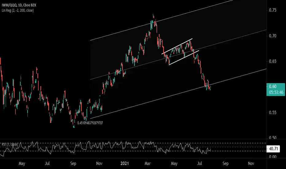
Pairs Trade Idea: Long Small Caps-Short Nasdaq 100 (IWM/QQQ)Looking at the relative ratio chart of IWM/QQQ, we note the price trading at the lower boundary of the linear regression channel, having recently completed it's bear flag formation. As a pair one could consider a long IWM ETF/short QQQ ETF, at current levels or better.
Current ratio: 0.60
Preferred buying range: 0.57-0.60
Stop: 0.54
Target Range: 0.65-0.67
Elliott Wave Analysis: SP500 Is Nearing 2018 Highs In Gold PriceHello traders and investors!
Today we will talk about stocks, specifically S&500 against GOLD (SPX/GOLD ratio chart), in which we see an interesting development we want to share.
As you can see, stocks remain in the strong uptrend and there can be room for more gains, we just have to be aware of another, higher degree correction as S&P500 is approaching 2018 highs in gold price, clearly for the 5th wave. We know that after every five waves, a three-wave correction follows, so be aware of limited gains on stocks, while GOLD may find the support soon.
Of course, it's a weekly chart and there's still room for slightly higher levels to break into 2018 highs, so it may take some time before we will see a change in the trend, ideally till the end of summer.
Be humble and trade smart!
If you like what we do, then please like and share our idea!
Disclosure: Please be informed that information we provide is NOT a trading recommendation or investment advice. All of our work is for educational purposes only.

Tin vs Silver monthly ratio chartIncreased probability important bottom in silver when upper line is touched for the tin vs silver ratio.
Adding that to other evidence, and you get a sense of what is next.
